KIRA KANA’S IRREGULON
26 Feb 2014, Posted by in BlogAbout Kira Kana.
Kira Kana is a classically trained experimental type designer interested in creating unique and usable fonts. She likes to play with different shapes and styles, and is a big fan of handwritten cursive.
She came to Berlin via Melbourne-via-Tokyo-via-Shanghai-via-Bangkok-via-Melbourne, Australia. The decision to move to Berlin for a few years rather than another place was made on a whim, because why the hell not.
Like most Melbournians, she is unimpressed by the quality of most coffee. It is always taken without sugar or milk.
She runs a Japanese Curry pop-up called Kaizoku when she isn’t designing, and was given a feature interview in a German newspaper about it. She misses good cheap sushi.
She likes reading fat novels which are usually either of a science-fictional bent, or non-fiction. She finds that a lot of the comic book writers she likes often are British.
She doesn’t watch TV, and figures nobody else really does now, either.
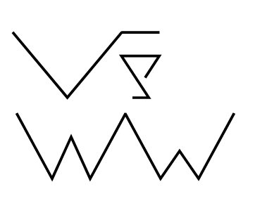
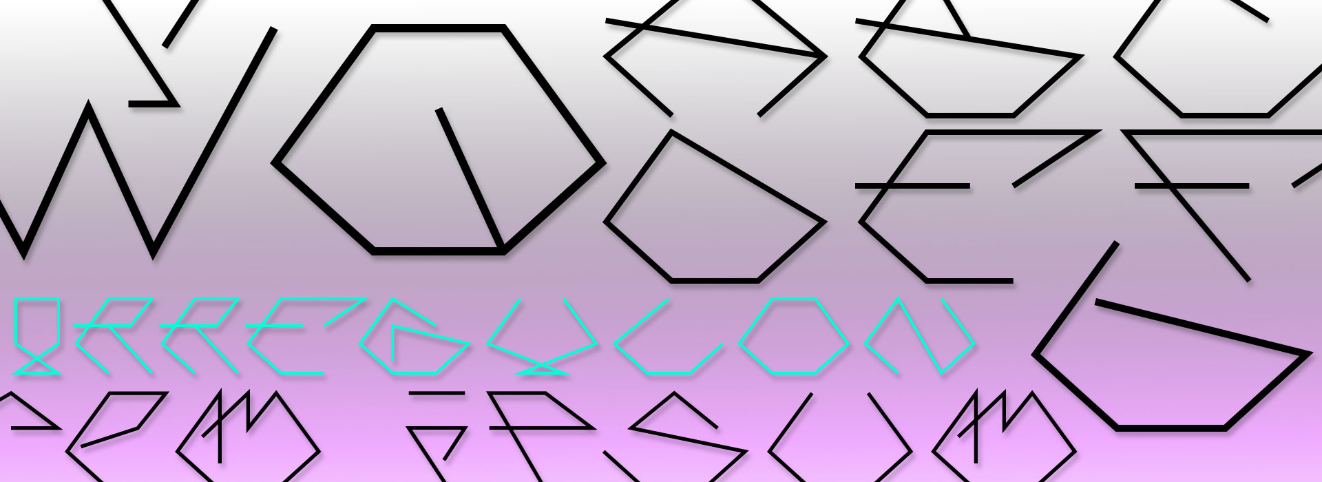
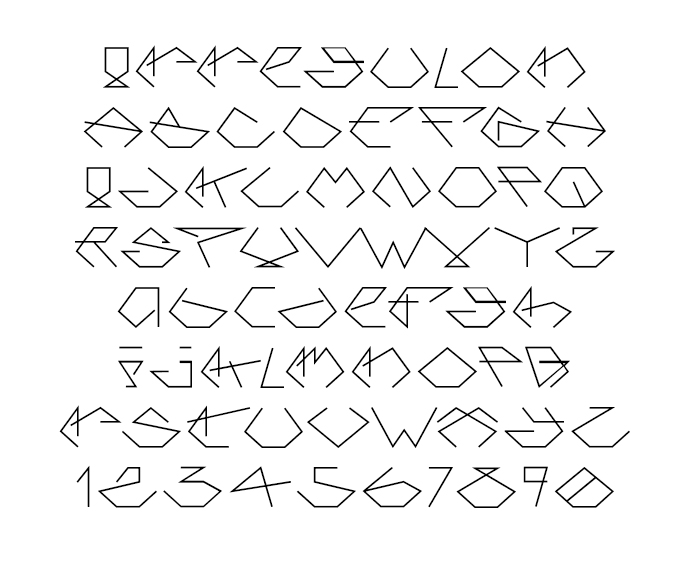
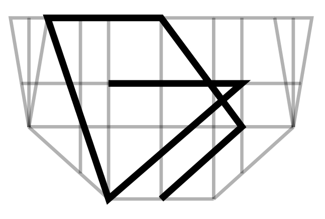
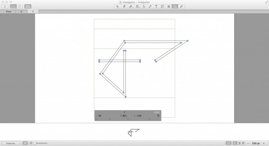
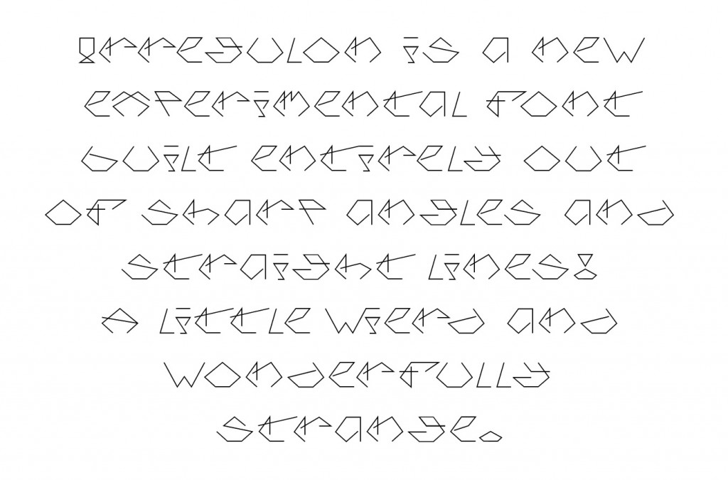
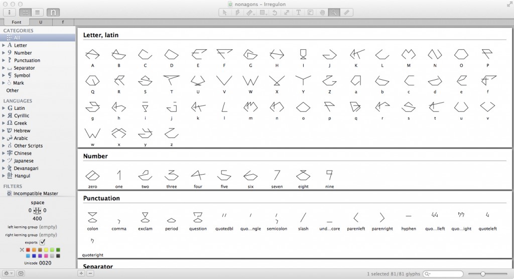
Irregulon is meant to be fun to use and design with. There’s a few effects built into the font, for example, the lower case i is created to join up with the upper-case V, rending a ligature unnecessary and adding unexpected graphic impact. If you’re tired of using Eurostyle, you now have a brand new typeface to use for the signage on your space station, and you designers can use these odd and unusual shapes to experiment with in your own graphic projects.
Write an email to kk@lettersaremyfriends.com if you want it!
![]()

Sorry, the comment form is closed at this time.