LF BOPP SPIRELLI
Category: Fonts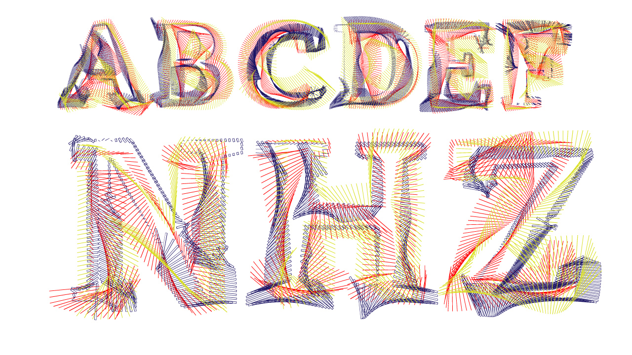
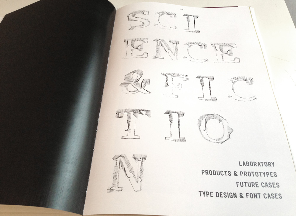
font creation LF BOPP SPIRELLI
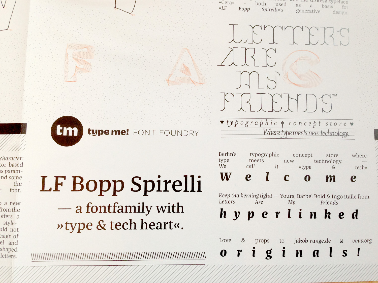
— A fontfamily with »type & tech heart«.
__________________________________

Story. As Jakob Runge finished his new font »Franziska« in early 2013, he made an open call for designing specimen for a booklet publication. We used the opportunity to remix his font within our vvvv-typekit, which we had developed around the same time.
By adding certain new properties to the base vectors and go from there to a completely different typedesign direction, we came up aesthetically with a new sort of fontcase: based on Franziska, but not looking like it anymore!
A hyperlinked original! »LF Bopp Spirelli« was born. — A fontfamily with »type & tech heart«.
Again, for us it is not about creating the perfect typeface, rather than to understand an extending method and its infinite possibilities by remixing components.

For now, we released three styles: style »Spike« i.e. is based on »Franziska«, while style »Spike Grotesk« is based on »Cera«, both original typefaces by Jakob Runge of »type me! Font Foundry«. It was obvious that we’ve asked Jakob Runge to fontengineer this adventurous font case.
Therefor you could see this font above as an exemplary showcase out of million styles, we could have done.
Modifiactions were created in our developed framework »Buchstabengewitter«, a two component type generator, which literally acts out of character: – one part contains a vector based font – the other part contains parameter sets of rotation, lines and some math, relating to the outlines of the basic font.
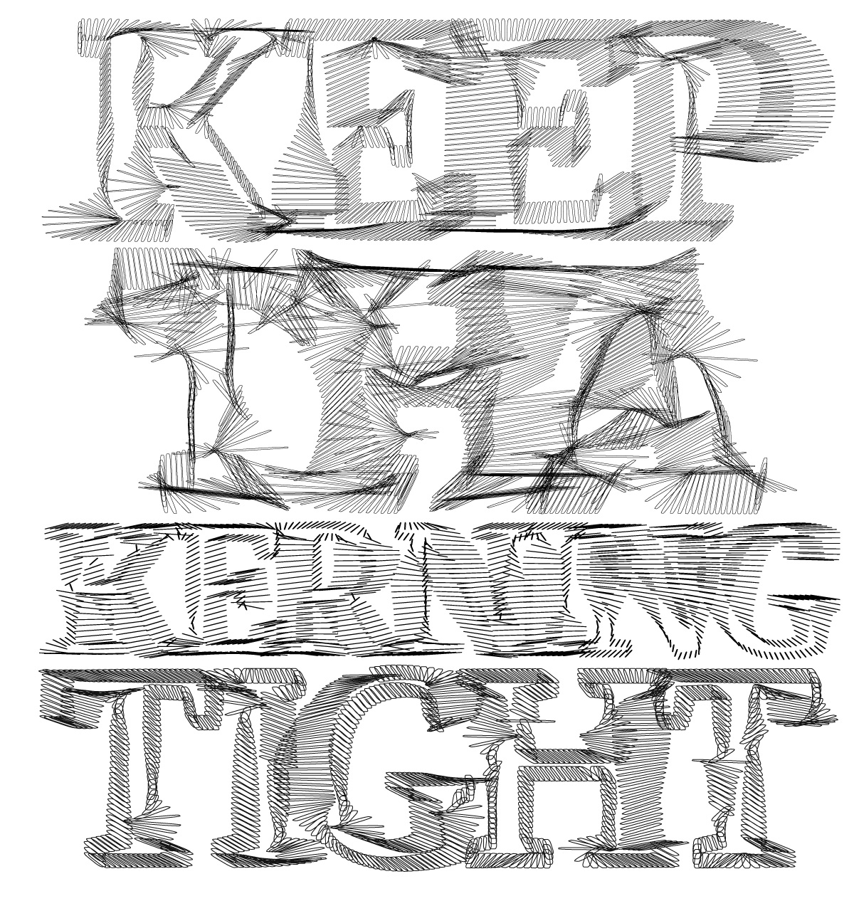
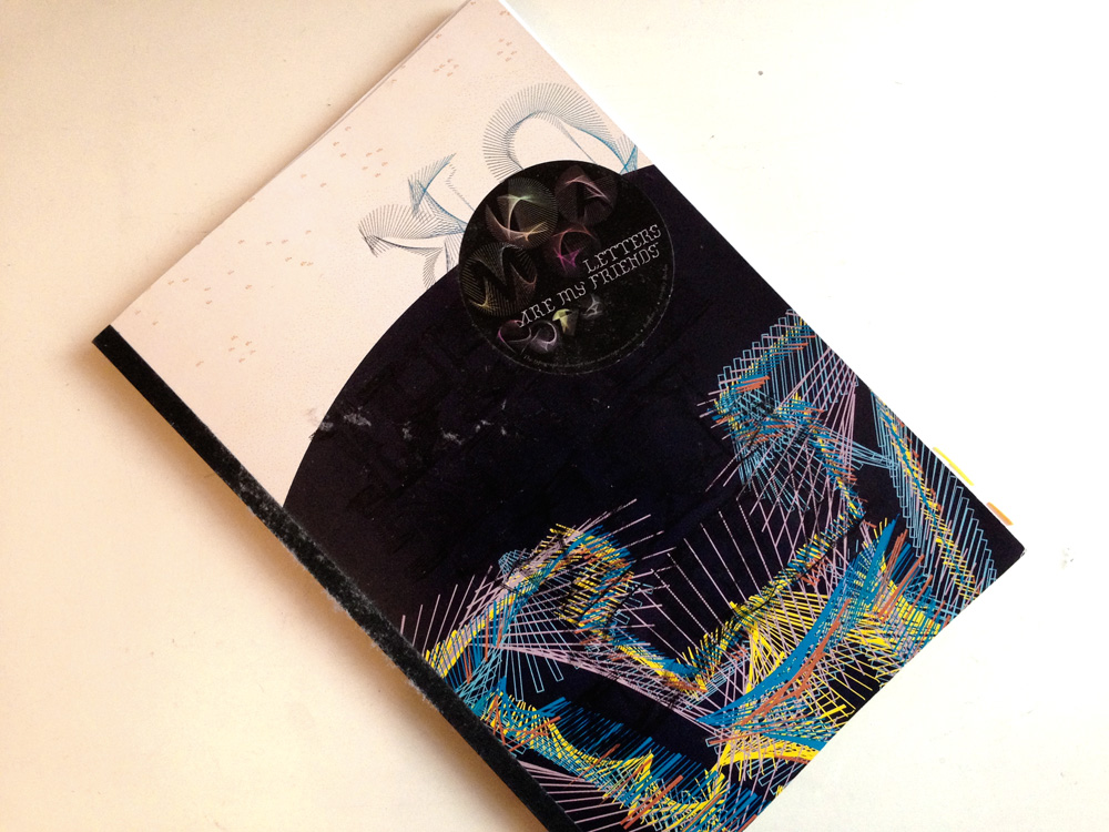
We decided to use it for our book we working on: Letters Are My Friends’ »Keep Tha Kerning Tight«. And here we are!
Now, it’s time to get
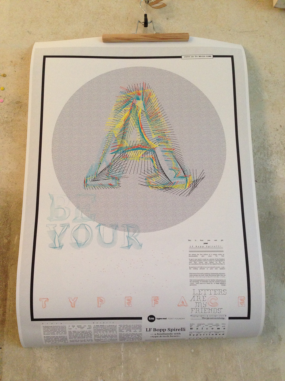
YOUR LF BOPP SPIRELLI! Therefor you need the poster!
So, just click the button here and follow the paypal instructions. And don’t forget to add you adress! Or send it extra via email. Of course you can also stop by in our typographic concept store at Boppstrasse 7, 10967 Berlin and pick it up personally.
To receive the orginal font-files you need to take a picture of the finished »drawing by numbers« which you will find on the poster. – For a donation of 8 € we send you the poster, wherever you are!
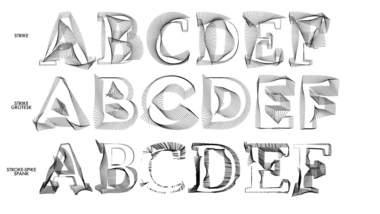
STRIKE:
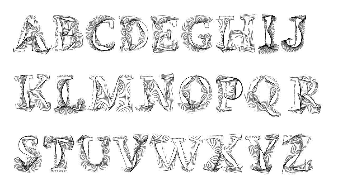
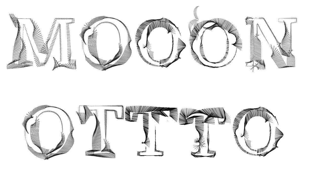
This style is based on the font FF Franziska and floats with some decent rotation and long lines.
STRIKE GROTESK:
This style uses quite the same parameters, only changes the base font to Cera.
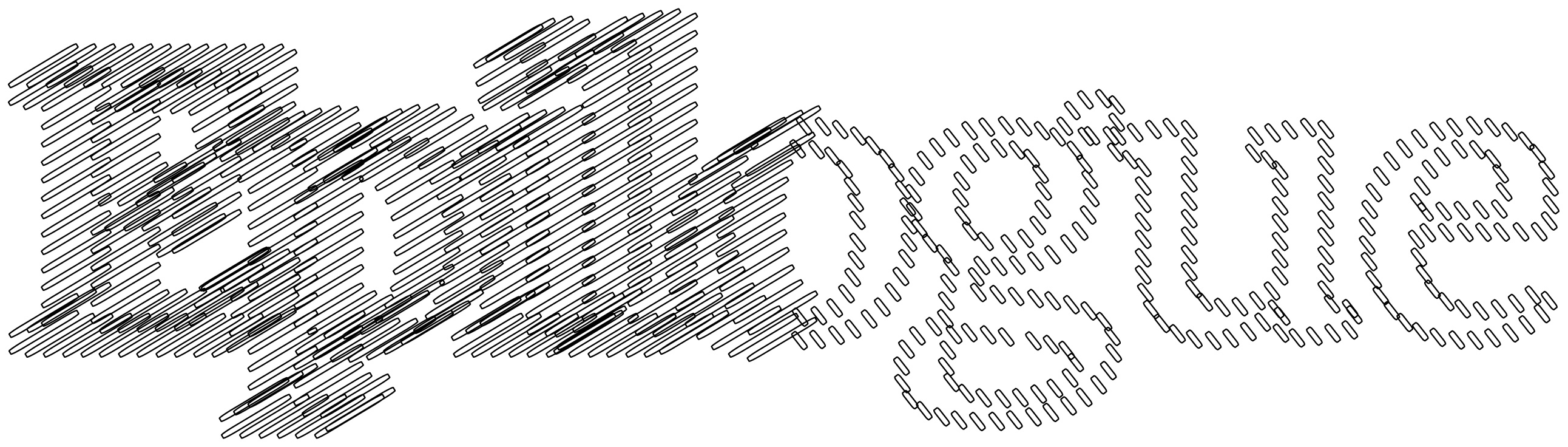
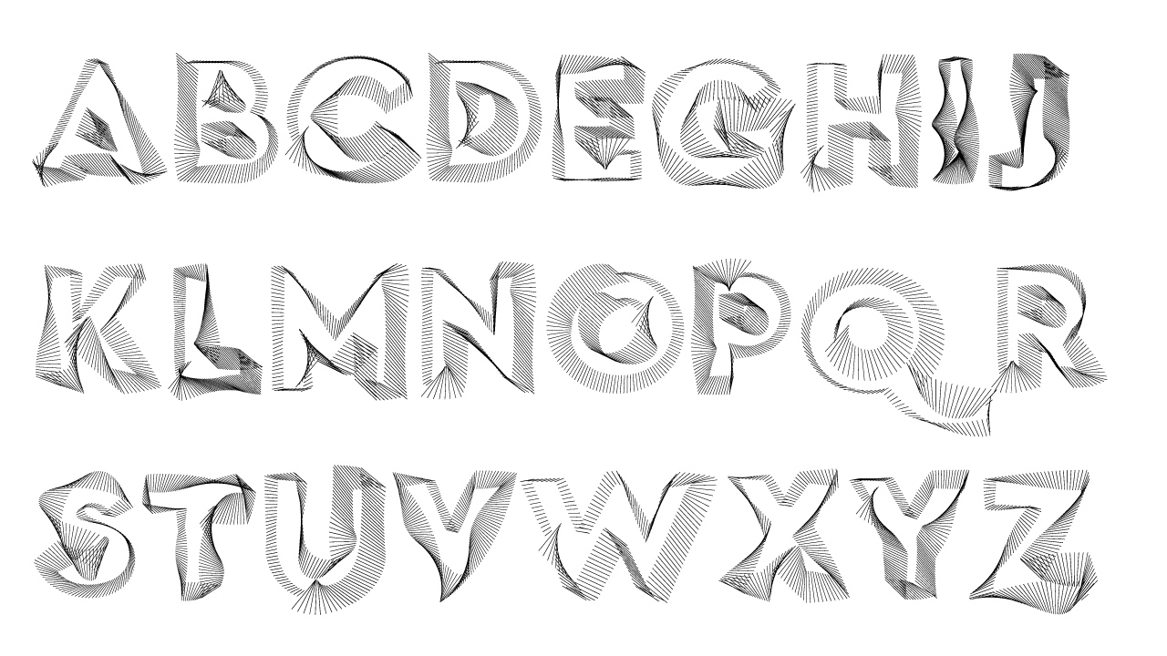
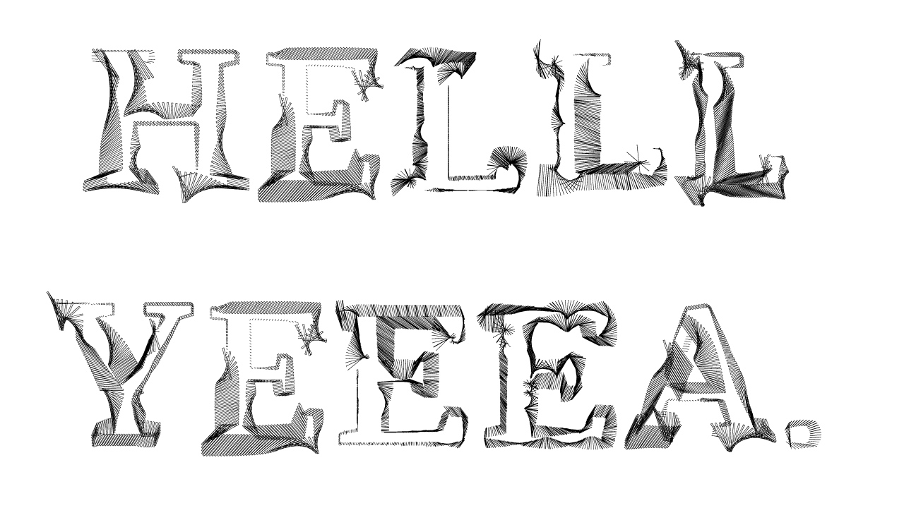
STROKE – SPIKE – SPANK:

This style is a mixture of 3 different parameter sets, which are similar but vary, again based on FF Franziska. Additionally it come with a feature on randomized alternative characters.
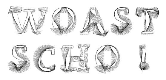
DEMO:
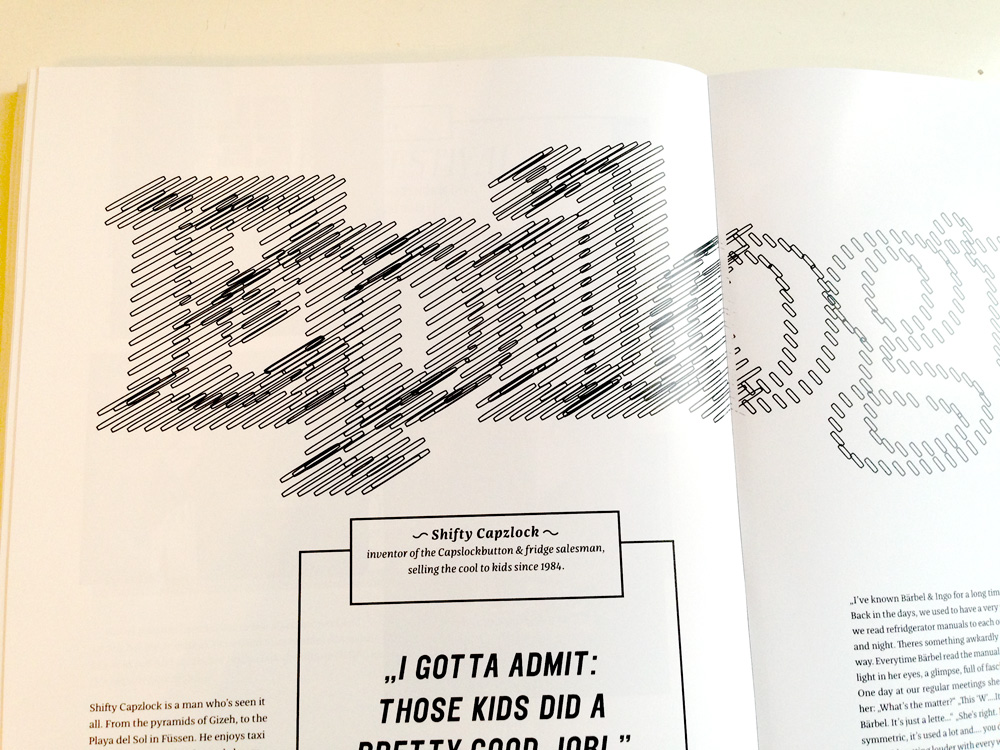
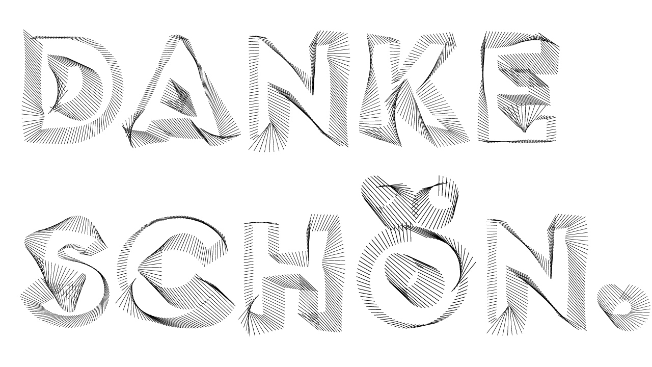
This is what we send Jakob for the Franziska specimen call:
POSTERDETAILS. 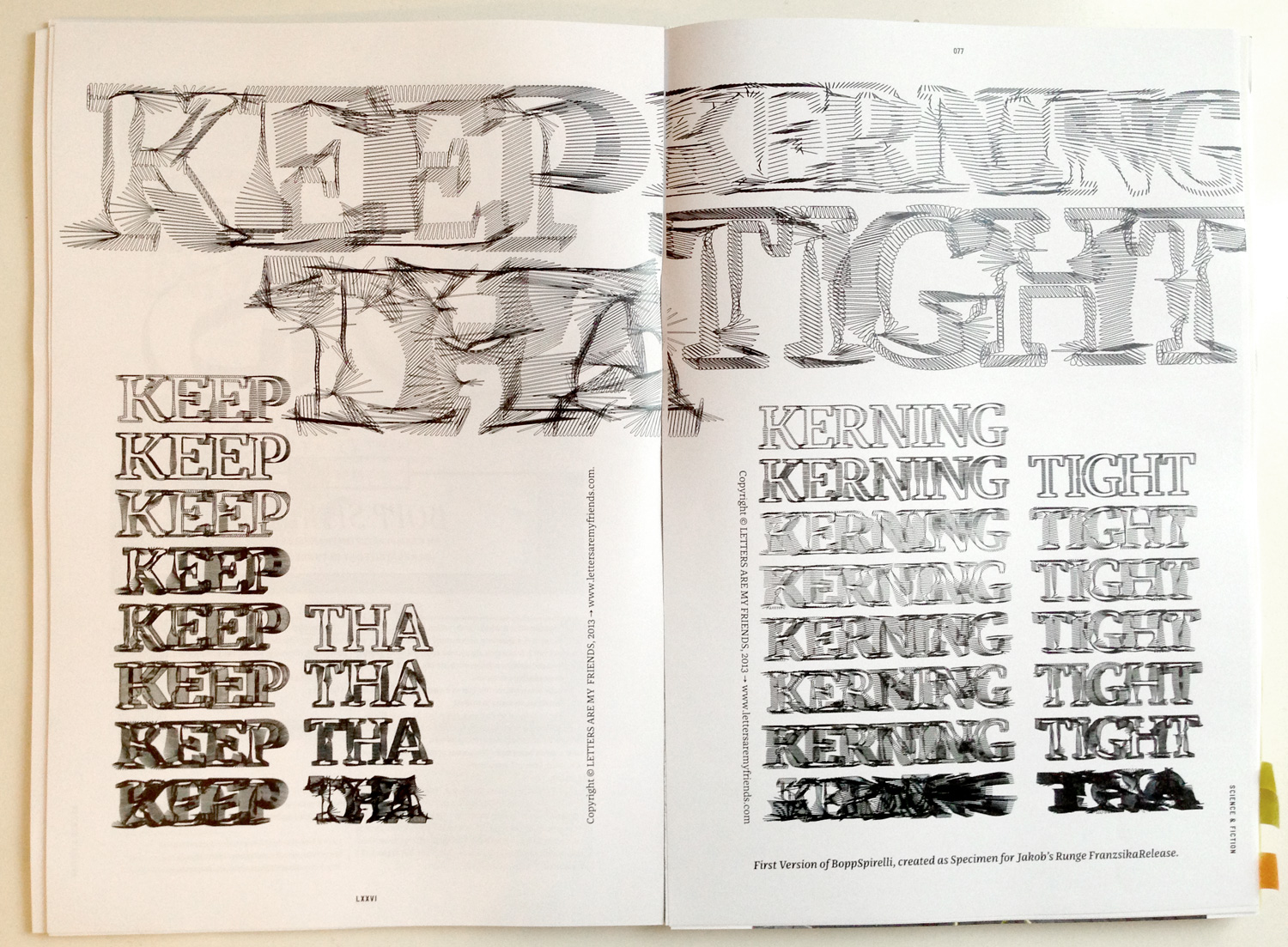
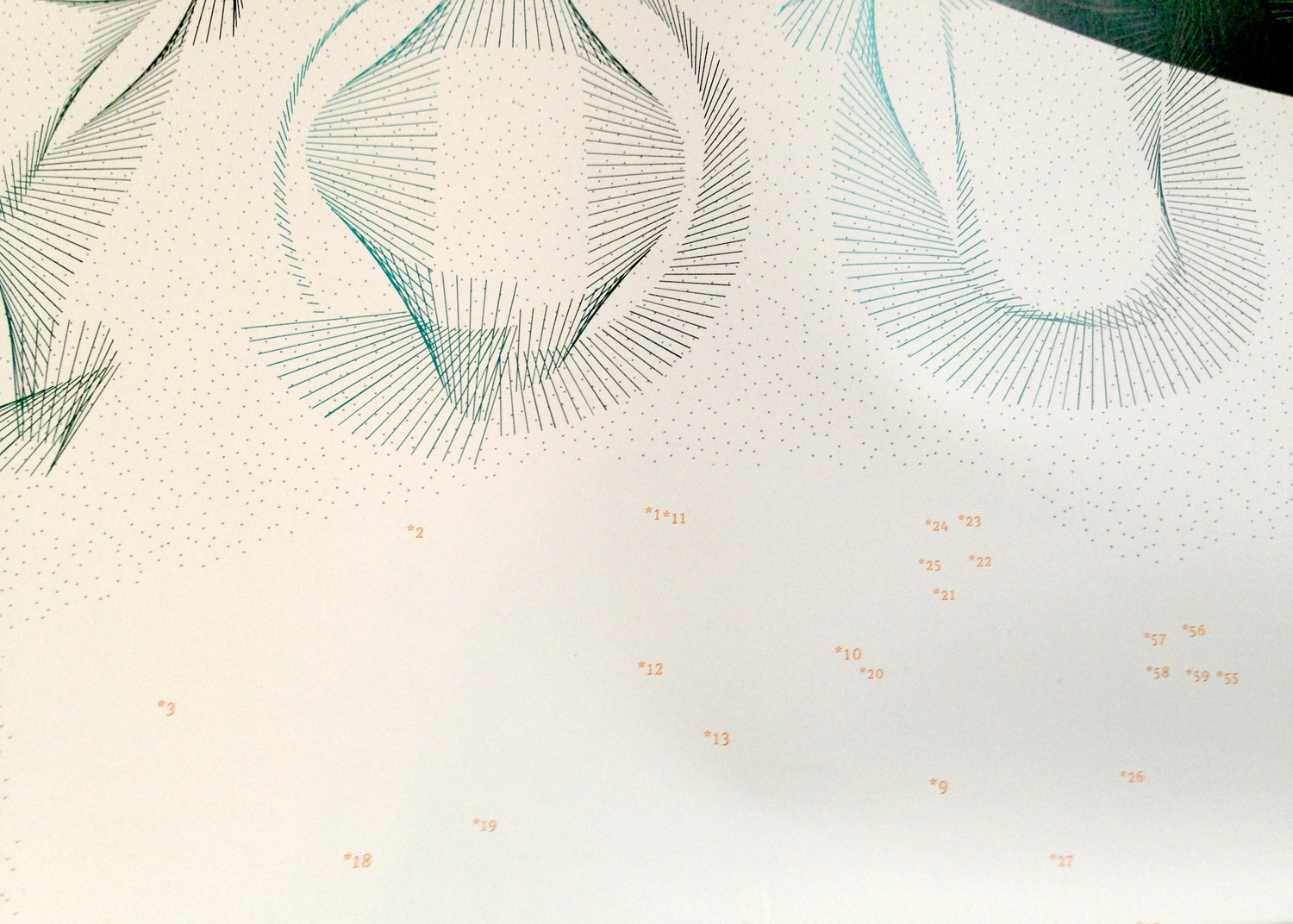
A glimpse of how we use it in our book “KEEP THE KERNING TIGHT”, which is gonne be released 2014.